Untacit.

Interactive course

Structure a Page

Stage 3 · Organize information with planning, hierarchy, space, containers, and layouts

4 sectionsEstimated 60 min
01 / 04

Do not fill the page from the top-left corner

Visual notes often fail because the page had no plan, not because the drawing was poor.

Make three choices before you begin:

  1. One-sentence purpose — who should understand what?
  2. Three content zones — no more than three main areas
  3. Reading direction — left to right, top to bottom, or centre outward?

Draw three matchbox-sized thumbnails:

  • A: three columns
  • B: central theme with ideas around it
  • C: a path from problem to result

Spend only 30 seconds on each. Choose the one that fits the relationship, then enlarge it.

Plan a page for a 30-minute meeting:

  • top 15%: title and goal
  • left 30%: context
  • middle 40%: discussion and options
  • right 30%: decision and next step
  • spare area at the bottom: parking lot and unknowns
02 / 04

Let the eye find what matters first

Visual hierarchy is not decoration. It tells the reader where to start, where to go next, and what can wait.

Use four controls:

  • size for titles and conclusions
  • weight for boundaries and priorities
  • position near the starting point or centre
  • colour for a decision, risk, or change
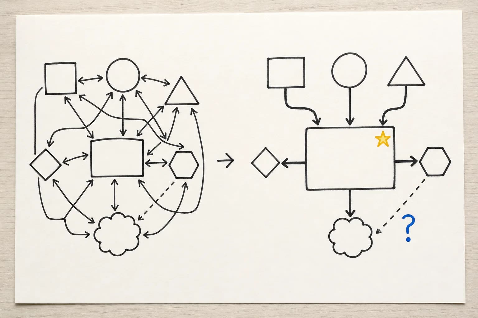
The same content before and after hierarchy is added through size, line weight, position, and colour
Before and after · hierarchyThe right side adds no information. It changes only size, weight, position, and one accent colour, and a reading order appears.

Mind the gap

Whitespace uses distance to communicate:

  • keep items in one group close
  • separate different groups
  • leave breathing room below a heading
  • keep a safe margin around the page

Copy the same six words twice. In the second version, double the size of one word, group two words in a light box, mark one risk with colour, and leave a finger-width gap between groups. Compare which version is easier to explain.

03 / 04

Boxes show boundaries; arrows show relationships

Containers and arrows are easy to overuse. Before adding either, ask what it is saying.

Every arrow should read as a sentence:

  • A causes B
  • A comes before B
  • A depends on B
  • A sends information to B
  • B feeds back to A

Use a solid line for a stable relationship, a dotted line for a hypothesis, and a two-way arrow only for genuine mutual influence.

Draw five boxes and connect them with five different relationships. Write one verb beside each arrow.

04 / 04

Find the relationship, then choose the layout

A page structure is not a style preference. Different layouts answer different questions.

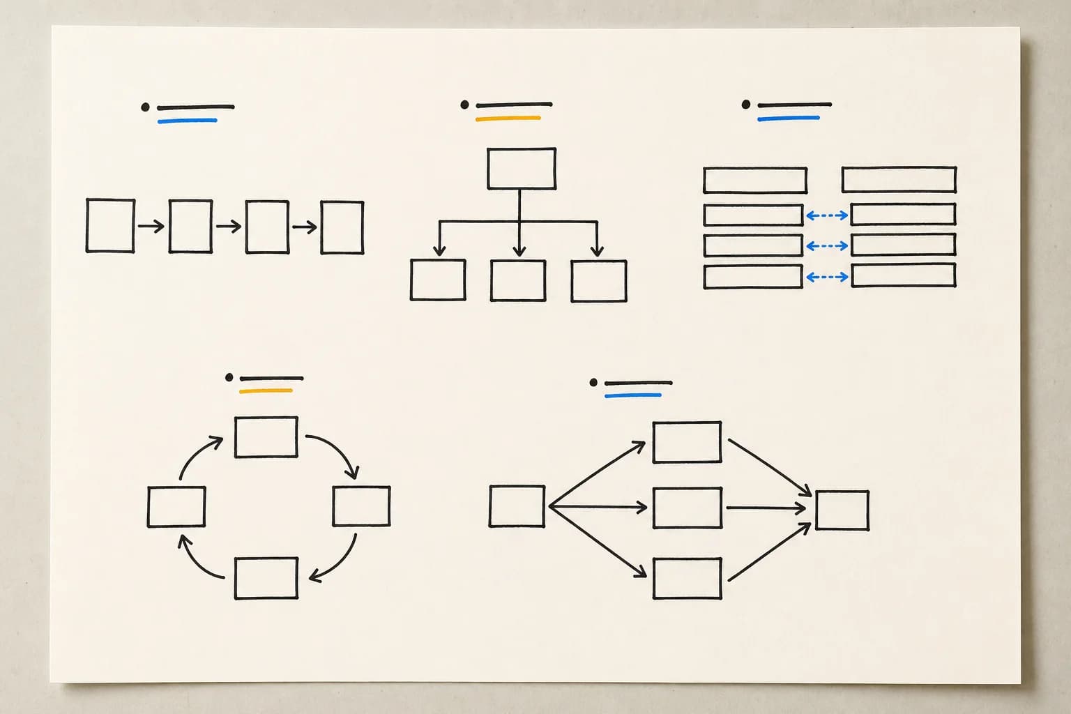
Hand-drawn examples of sequence, hierarchy, comparison, cycle, and convergence layouts
Layout atlas · 01Top row: sequence, hierarchy, and comparison. Bottom row: cycle and convergence. Let the relationship choose the page.
  • “What happens first?” → timeline or linear
  • “What is different?” → comparison
  • “What belongs to whom?” → hierarchy or containers
  • “What surrounds the topic?” → radial
  • “How do we get there?” → path
  • “How does it repeat?” → cycle

Take one topic and draw three thumbnails: comparison, timeline, and path. Circle the one that is easiest to explain.