
Let the eye find what matters first
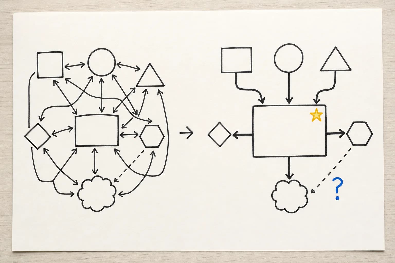
Visual hierarchy is not decoration. It tells the reader where to start, where to go next, and what can wait.
Use four controls:
- size for titles and conclusions
- weight for boundaries and priorities
- position near the starting point or centre
- colour for a decision, risk, or change
Mind the gap
Whitespace uses distance to communicate:
- keep items in one group close
- separate different groups
- leave breathing room below a heading
- keep a safe margin around the page
Copy the same six words twice. In the second version, double the size of one word, group two words in a light box, mark one risk with colour, and leave a finger-width gap between groups. Compare which version is easier to explain.